


《鄉民大學問EP.36》字幕版|韓院長的突襲!藍綠白委員見“韓國魚”驚呼!謝龍介不敢睡 稱愈晚愈high在忙那椿?葉元之公開立院頭號女戰神是“她”!王世堅自豪這點連韓國瑜也比不上!|NOWnews
NOW影音
更多NOW影音


焦點
更多焦點-

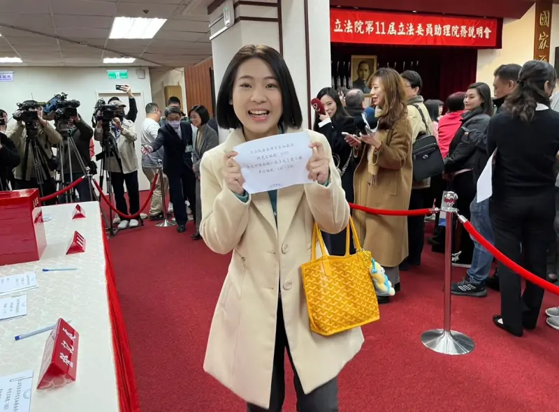
巷仔內/神擋殺佛仇恨值超高!徐巧芯遭炎上 綠營人人補刀蹭流量
國民黨立委徐巧芯大姑捲入詐騙洗錢案,他澄清自己絕未涉入,但綠營哪可能放過他,從他哭倒傅崐萁懷裡、老公劉彥澧免役、再到全身上下行頭、財產年增4百萬,全部都成了攻擊焦點,近日政壇最火紅新聞,全都離不開徐巧
2024-04-19 07:00
-

凱銳林傳凱汽車後座娛樂小巨人 揮別陰霾!目標明年集團營收百億
凱銳光電、VOLVO凱銳汽車董事長林傳凱為大同林家第四代,但他領軍凱銳成為全球前三大汽車後座娛樂系統商的14年來,在車用電子市場裡鮮少主動提及自己的背景,靠著親力親為、誠信、堅強的實力與好口碑,贏得許
2024-04-19 07:00
-

陳芳語撇清謝和弦沒用!網友嘲諷「絕對X過」 她憤怒回5字反擊
音樂圈爆發桃色蜘蛛網情節!朱軒洋劈腿吳卓源,意外扯出謝和弦前妻Keanna與陳芳語(Kimberley)的陳年恩怨,Keanna堅稱謝和弦婚內劈腿,與陳芳語在錄音室密室交歡,怒控她是「假面甜心」,當事
2024-04-18 17:57
-

高雄民宅凌晨氣爆!男疑引爆瓦斯90%灼傷 事故釀1死4傷、2失聯
19日凌晨,高雄三民區褒忠街某民宅,疑似遭人縱火發生氣爆事故,消防局獲報後,立即派遣人車前往救援,初步了解,目前氣爆釀1人死亡、4人傷勢嚴重送醫,以及2人失聯中,由於爆炸造成玻璃破裂,約有10幾人遭噴
2024-04-19 02:19
-

直播/戰貓來了!蕭美琴現身政大校園 與大學生暢談青年議題 由政大學⽣會、學⽣議會主辦,並與《 NOWnews 今⽇新聞》共同合辦之「政治進 ⼊⼤學 2.0?!-青年與副總統候選⼈」講座,今晚在政大登場,今晚七點,民進黨副總統候選人蕭美琴將現身政大,與青年學⼦
MORE -

千人線上祈雨!石門最新降雨量曝光 全台6水庫蓄水量低於30% 全台水情拉警報,霧社、仁義潭、白河3座水庫蓄水量不到2成,石門、明德、南化也不到3成。北台灣於今(18)日降下大雨,千人線上祈雨之後,石門水庫也開始受到雨水挹注,截至上午10時,確切蓄水量從原先的21
MORE -

下月9日就是蘇聯二戰勝利日!烏克蘭指揮官:俄軍恐佔領烏東要塞 5月9日是俄羅斯紀念前蘇聯時期、戰勝納粹德國的「勝利日」,對俄國來說意義非凡,烏克蘭最高指揮官14日坦言,俄軍恐在那之前,佔領烏東要塞恰西夫亞爾(Chasiv Yar),為爭奪東部高地控制權奠定基礎。
MORE -

再生能源怎推廣?網友提案「放寬綠電憑證」 民進黨政府上台後,力推再生能源,經濟部在2016年提出,目標2025年能源佔比為燃氣5成、燃煤3成、再生能源2成;但今年年初,經濟部悄悄將再生能源佔比目標下修為15.2%。經濟部雖解釋是因近兩年經濟高
MORE -
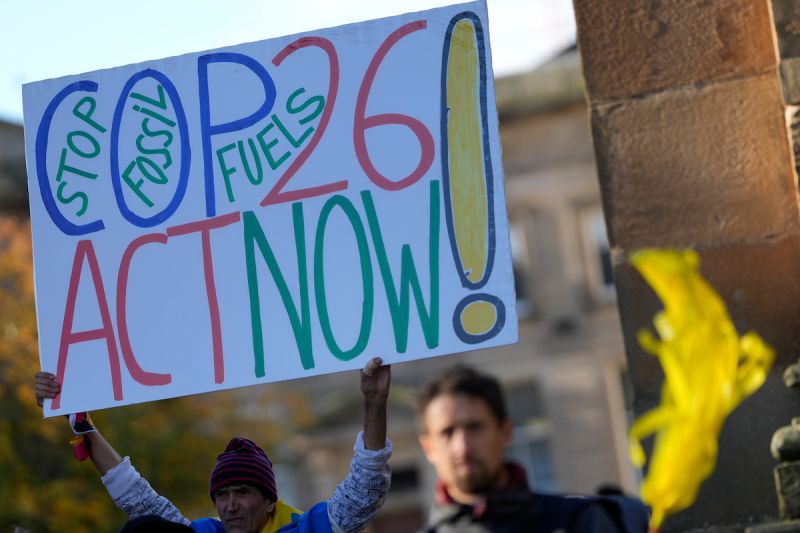
備戰碳交易7/氣候變遷末日倒數 各國力拚2050淨零碳排 世界各國如今面臨全球性的氣候變遷危機,總統蔡英文去年也宣示台灣將和國際主流同步,達到「2050淨零排放」目標;事實上,在去年第26屆聯合國氣候變遷大會(COP26)當中,多國共同簽署了《格拉斯哥氣候協
MORE -

FEniX被問同時愛上一個女孩該搶還是退?5人答案很優秀 來勢洶洶!全方位人氣男團FEniX五位成員夏浦洋、陳峻廷、曹家齊、MAX(徐彭臒)與李承隆,自推出首張同名正規專輯後,一路以來深受「救火隊(官粉名)」強大支持,加上新歌曲曲動聽,因此讓FEniX專輯口
MORE -

不用羨慕李多慧!台灣也有外援 MIT正妹邱品涵加入日職福岡軟銀 中華職棒第35年正式開打,球迷們也熱血投入,為自己支持的球隊加油。提到棒球,當然不能錯過日本,許多球迷會特地前往日本主要城市觀看棒球,而福岡更是日本目前最熱門的自由行之一。福岡擁有許多景點,包括九州最
MORE -

A漫異想世界 MORE -

日本成人片未來「動作只能演」 女優計畫毀了活不下去 日本AV產業大改革,「AV演出被害防止・救濟法案」參議院通過後,許多AV女優哀號沒了工作,各個拍攝合約與日程不斷延期,連男優都閒到跑去抓蟲,沒了收入十分淒慘。不少AV女優因為AV新法影響工作,金苗希實
MORE -

要求公布加熱菸審查資料遭拒 賴香伶怒:要掀開「黑箱衛福布」 衛福部國健署已召開完9月中第一次的加熱菸健康風險評估審查會議,立委賴香伶指出,她於9/17再次發函,要求衛福部國健署提供專家學者名單、議審查標準、資料及發言過程直播影片,卻遭衛福部拒絕。賴香伶表示,希
MORE -
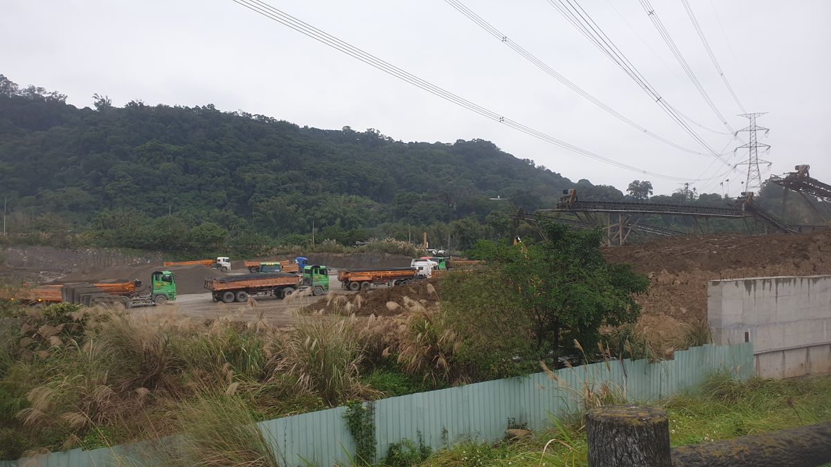
竊占國土7/國產署坦言人力不足 每年追討進度不如預期 非法砂石業者占用國土問題相當嚴重,全台灣各縣市都有此現象。根據財政部國有財產署在2020年的統計資料,我國的國有土地總面積約223萬7268公頃,「非公用國有土地」約21萬9543公頃,被侵佔達2萬3
MORE -

今年首見「侵襲性b型嗜血桿菌」確診案!8旬婦感染 易誤認成感冒 衛福部疾病管制署今(2)日公布國內本(2024)年首例「侵襲性b型嗜血桿菌感染症」確定病例,為南部80多歲女性,為機構住民,3月20日出現發燒、畏寒及呼吸喘等症狀送至醫院就醫,因疑似敗血症收治住院並由
MORE -

被偷走的那疫年 MORE -
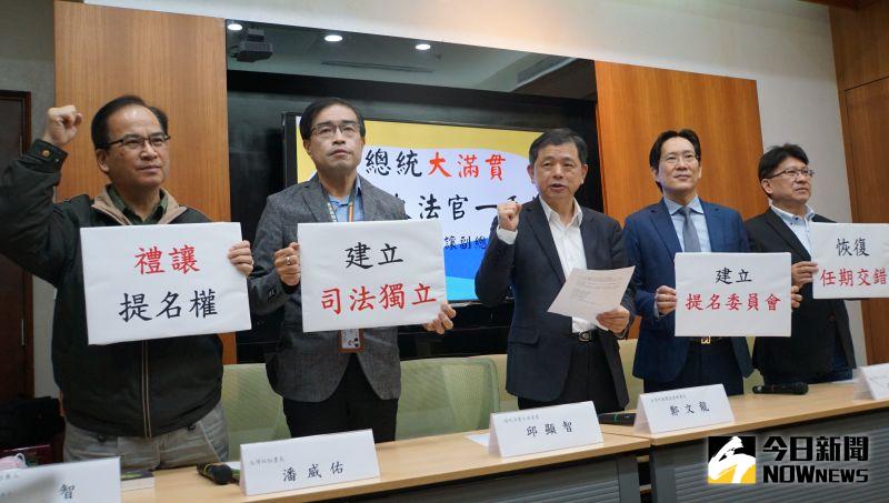
大法官提名權總統一手抓 民團籲修憲禮讓副總統與在野黨 4位現任大法官即將任期屆滿,依慣例總統府召集審薦小組,並於昨日召開第一次會議,但檢視大法官名單,民團與在野黨質疑15位大法官均由蔡英文總統提命後任命,恐有違憲與無法維持三權分立疑慮,呼籲修憲恢復任期交
MORE -

影/獨家創舉挑戰不可能 日環食節目全紀錄 於6月21日下午,天文奇景「日環食」登場亮相。《NOWnews今日新聞》獨家透過航機空拍,以空拍鏡頭,帶給觀眾不同角度,一覽日環食的奇蹟美景。▲NOWnews獨家空拍日環食,空中拍攝到日環需在事前透過
MORE -

足球/梅西今夏恐將離隊 ESPN:PSG希望他能降薪3.31億 梅西(Lionel Messi)和法甲聯賽巴黎聖日耳曼(PSG)球迷之間的關係惡化,這可能也將影響到他未來的續約意向,根據法國媒體《RMC Sport》記者Fabrice Hawkins報導,除非情況
MORE -
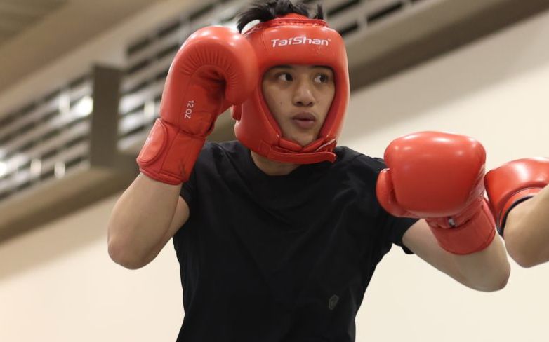
拳擊女王陳念琴分享戰勝淋巴癌歷程 邊吐邊練也不曾放棄 在東京奧運挺進8強的「拳擊女王」陳念琴,在賽場的英姿,台灣民眾歷歷在目,但很多人都不知道,其實他在挑戰奧運賽場前,才面臨了病痛的磨難,距離原訂的奧運比賽時間只剩下半年,她卻意外查出罹患了淋巴癌,突如其
MORE -
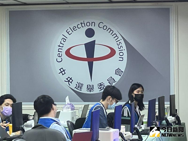
九合一大選確診者不得投票!60508人權益受損 監院促請2機關檢討 去(2022)年九合一選舉,依中央選舉委員會、中央防疫指揮中心考量疫情及選務人力,決議COVID-19非重症確診者不得外出投票,引發剝奪人民投票權爭議,監察院也立案展開調查,並於今年7月18日,通過監
MORE -

中華職棒/還不是靠恰恰!彭政閔清壘打兄弟下半季封王 中信兄弟今天在台中洲際棒場出戰富邦悍將,只要避免落敗就可以拿下下半季冠軍,結果兄弟不只贏球,還靠精神領袖「恰恰」彭政閔敲出清壘二壘安打,一棒終結比賽,終場兄弟以8:3贏球,也順利拋下黃色彩帶。前天才剛
MORE -

列入時代雜誌百大影響力人物 賴清德榮幸:持續捍衛台灣民主 美國「時代雜誌」公布2024年百大最具影響力人物名單,台灣總統當選人賴清德入列。對此,賴清德今(18)日表示,他會以解決問題的態度、彼此信任的精神,持續捍衛台灣民主,團結守護這個美麗的國家。時代雜誌公
MORE
要聞
更多要聞-

徐巧芯財產申報被翻出 夫婦年收420萬「存款一年竟暴增415萬」
國民黨立委徐巧芯近日因大姑洗錢案成為焦點,又被台北市議員苗博雅爆全身上下行頭價值驚人。而民進黨新北市議員李宇翔也發現,徐巧芯夫婦一年的存款竟暴增415萬,質疑錢從何而來?要求徐巧芯趕快清楚說明金流爭議
2024-04-18 20:00
-

「中天殺手」離職馬上加入詐團?張斯綱示警:NCC恐不只蕭祈宏
雲林地檢署日前查出3家第二類電信業者銷售非法網卡,去年底起訴22人。近日更發現竟有NCC通傳會前委員蕭祈宏擔任二五電訊公司顧問,使該公司通過NCC相關行政稽查。雲檢隨即依違反《公務員服務法》起訴蕭祈宏
2024-04-18 19:20
-

傅崐萁訪中警告民進黨「不准表決」 綠委不滿狂轟:哪來的臉?
國民黨立法院黨團總召傅崐萁預計帶領多位國民黨立委前往中國訪問,由於時程強碰立法院會期,傅崐萁警告民進黨「若敢偷襲會立即還以顏色」。對此民進黨立委林俊憲質疑,會期中把20幾個立委帶去中國,還有臉說「不准
2024-04-18 19:01
-
徐巧芯豪贈婆婆100萬?綠議員質疑「用途何在」:金管會要查!
近日國民黨立委徐巧芯的大姑夫婦涉及洗錢詐騙案引起各界討論,徐巧芯聲稱,大姑夫婦的公司是婆婆「借2000萬」開的,她還幫忙「出100萬」,但這筆錢是代墊還是贈與,徐巧芯說詞反覆。新北市議員張嘉玲對此表示
2024-04-18 18:48
新奇
更多新奇-

台大AV女優宣布徒步環台!首日狂走20公里「腳起水泡」 現況曝光
去年考上國立台灣大學的AV女優魏喬安,日前在社群平台上宣布要徒步環島旅行,第一天就狂走20公里,從台北車站走到三峽,也讓她腳上起水泡,再加上同行夥伴遭野狗咬傷,只能暫時回台北休養,不過她也強調,到下週
2024-04-18 20:05
-

一堆人到巴黎錢包被偷!黃大謙帶「8個錢包」實測 驚人結局曝光
法國的首都巴黎是擁有數千年歷史的古都,也是許多遊客到訪歐洲必去的浪漫城市。但當地治安卻總是亮起黃燈,一堆人都曾在當地錢包、財物失竊,當有人要去巴黎時,幾乎被提醒的第一句都是「小心錢包被偷」。對此,Yo
2024-04-18 18:38
-
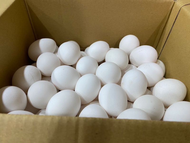
佛心蛋「1顆賣1元」!每人限5顆 阿姨買100顆遭拒狂酸:還怕人買
不要糟蹋別人的心意!近期雞蛋價格雖然沒有去年「蛋荒」時昂貴,但想要買到一顆1元的雞蛋,仍可以說是天方夜譚。近期就有民眾表示,爸爸退休後迷上養雞、鴨,產生的蛋自家吃不完,就打算便宜販售,訂出「1顆蛋1元
2024-04-18 18:38
-
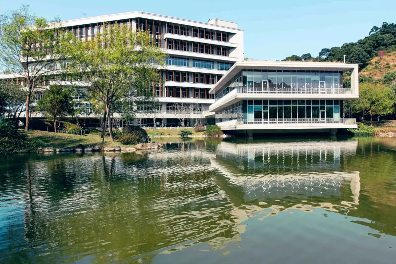
政大景觀池命名票選!「金玟池」得票63%暫居第一 超紅原因曝光
韓流魅力真的太強了!近期國立政治大學要達賢圖書館旁的景觀池命名,更舉辦了人氣票選比賽,也開放校外民眾參加,沒想到除了許多諧音梗紛紛出籠之外,還有韓星「金玟池」的名字也在其中,甚至還突破6成得票率暫居第
2024-04-17 21:53
娛樂
更多娛樂-

舒淇罕見告白馮德倫!歡慶48歲生日趴 「羞曬親親照」甜喊愛你
性感女星舒淇16日迎來48歲生日,今(19)日凌晨她曬出老公馮德倫為她準備派對的照片,同時也慶祝兩人結婚週年紀念日,舒淇罕見放閃甜喊「LOVE U」,還PO出兩人的接吻照,羨煞不少人,不到1小時就超過
2024-04-19 01:24
-

「反骨男孩」正妹陳語謙升格2寶媽 甜蜜大喊:是幸孕的生日
加入「反骨男孩」走紅的網紅陳語謙,2022年與男友登記結婚,隔年便生下愛女妍妍。昨(17)日陳語謙在IG上喜迎28歲生日,並宣布自己時隔1年再度懷孕即將升格「2寶媽」,並在IG上甜蜜地大喊:「是幸孕的
2024-04-18 22:18
-

林志玲罕見向婆婆「請假4天」!不捨2歲兒:離開最久的極限
林志玲從兒子出生起就時刻陪伴,雖然5年沒在大銀幕上出現,但仍心繫電影。去年林志玲重返金馬獎頒獎,老公AKIRA也到台北電影獎擔任頒獎人,可見十分相挺。今(18)日林志玲再度受邀出席第14屆北京國際電影
2024-04-18 22:06
-

峮峮首爾過34歲生日!驚喜合體韓籍隊友邊荷律 甜喊:烤豬肉之約
中信兄弟啦啦隊Passion Sisters峮峮將於明(19)日迎接34歲生日,近日她與鬼鬼、阿本及數名友人一同前往韓國旅遊,幾人一同前往首爾漢江河畔體驗自助泡麵,也體驗了穿著傳統韓服逛景福宮。今晚,
2024-04-18 21:52
運動
更多運動-

NBA附加賽完整賽程、戰況懶人包 生死鬥!老9公牛、國王最後一搏
(更新日期:4/18) NBA附加賽首輪「生死鬥」結局出爐,西區勇士中箭落馬,Curry神情落寞,勇士10年4冠王朝陣容也瀕臨崩解,東區老鷹則也率先出局。休兵一日,附加賽最終篇將上演,西區由鵜鶘對決國
2024-04-19 05:40
-

Klay Thompson季前不續約恐後悔莫及 美媒直言:勇士陣容必解體
西區第10種子NBA金州勇士在附加賽不敵西區第9種子沙加緬度國王,勇士也提前放暑假結束本季,其中勇士射手「K湯」Klay Thompson表現荒腔走板,成為球評、球迷砲轟的對象,更有球評直言,勇士陣容
2024-04-19 05:38
-
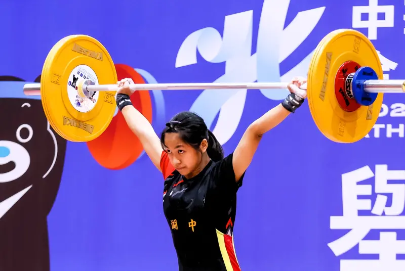
全中運/兩人三破大會紀錄 後起之秀!何盈禕、王昱鈞同日登頂
113年全國中等學校運動會舉重項目在臺北市大直高中展開,臺南市大內國中何盈禕在國女組40公斤級以抓舉50公斤、挺舉60公斤,總和110公斤,「3破」大會紀錄,並衛冕金牌。國男組55公斤級臺中市成功國中
2024-04-19 05:37
-

全中運/自由車場地賽、台中市包7金 西松高中秦力恩逆轉摘金
113年全國中等學校運動會自由車場地賽,在臺中市立自由車場進行第2天賽事,再頒出國男組、高男組、國女組和高女組爭先賽4金及個人追逐賽4金,臺中市再度展現強大實力,囊括7金,臺中市大甲高中獨佔3金、臺中
2024-04-19 05:25
財經生活
更多財經生活-
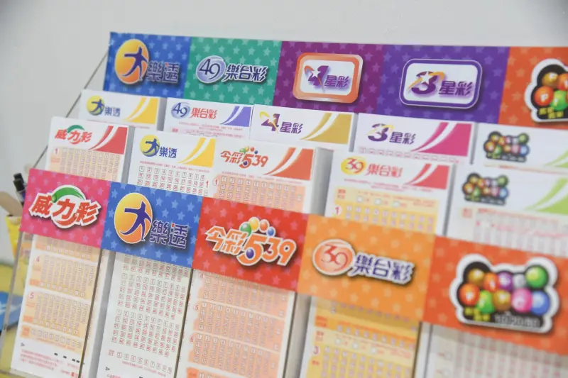
穀雨前夕財神躲起來!威力彩頭獎槓龜 4/18「最新獎號」一次對完
明(19)日就是節氣穀雨,今(18)日晚間威力彩第113000032期開獎,本期頭獎為2億元,不過最終沒有頭獎幸運兒出現,今彩539部分也沒有開出頭獎。4/18威力彩中獎號碼(第113000032期)
2024-04-18 22:10
-
日晚間頭獎獎金上看-18.3-億元,若一注獨得,將成今年度最高單注獎金。(圖/NOWnews-資料照)-1.jpg?unShow=true)
快訊/威力彩頭獎2億元!4/18「完整獎號」出爐 穀雨前夕迎財神
威力彩第113000032期今(18)日晚間開獎,本期頭獎為2億元,就在剛才最新的「完整獎號」已全數出爐,快拿出手邊彩券對看看,是否能在穀雨前夕迎接財神吧。4/18威力彩中獎號碼(第113000032
2024-04-18 20:49
-

抹茶控嗨了!肯德基「宇治抹茶白玉蛋撻」4/23開賣 優惠8折開吃
肯德基被網友稱為「被蛋撻耽誤的速食店」,不只原味蛋撻超有人氣,各式限定口味也是蛋撻迷的必搶美味!這回肯德基攜手日本百年老店「伊藤久右衛門」,從4月23日起帶來全新的「宇治抹茶白玉蛋撻」,讓你體驗雙職人
2024-04-18 19:15
-
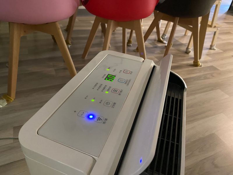
明天繼續下雨!除濕機「錯誤用法」別踩雷:浪費電、越除濕氣越重
今(18)日上午一波超強降雨進攻北台灣,明(19)日是這波鋒面逐漸遠離的時段,各地水氣仍偏多,這時候不少人都會打開除濕機,希望讓室內保持舒適,不過要記得打開除濕機前,一定要記得關閉門窗,否則開了相當於
2024-04-18 18:42
全球
更多全球-

自爆叔叔二戰失蹤「疑被食人族吃掉」!拜登發言遭官方資料打臉
美國拜登(Joe Biden)17日前往賓州匹茲堡出席造勢活動時,參觀了戰爭紀念碑,並在稍後於鋼鐵工會總部發表演說時,講述叔叔小芬尼根(Ambrose Finnegan Jr)二戰駕駛偵察機,疑似在新
2024-04-19 06:47
-
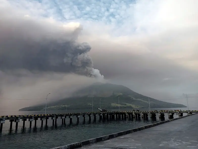
最高警報!印尼火山噴發疏散逾萬人、機場關閉 恐有海嘯風險
位於印尼北蘇拉威西省首府萬鴉老(Manado,也稱美娜多)以北100多公里處的魯昂火山(Ruang volcano)近日頻頻發生地震,自本週三開始已至少大規模噴發5次,印尼國家災害管理局(BNPB)發
2024-04-19 06:19
-

美英擴大制裁伊朗!針對無人機、飛彈製造商 避免中東局勢惡化
伊朗上週末在攻擊以色列本土後,週三(17)高調舉行閱兵,儘管伊朗外交部長阿布杜拉希安(Hossein Amir-Abdollahian)告訴美方無意擴大中東地區的緊張情勢,但美國與英國週四(18)仍宣
2024-04-18 23:17
-

波音吹哨者親上聽證會!含淚嘆「備受打壓」 預約門診也受阻撓
美國航太製造商波音(Boeing)今年接連傳出飛安事故,在波音工作了17年的工程師薩利普(Sam Salehpour)今年1月向美國聯邦航空管理局(FAA)提出指控,在17日國會聽證會上,薩利普指出自
2024-04-18 22:19